The dastardly dozen: The 12 ugliest pro cycling kits of all time… Where does the Ineos Grenadiers’ orange and grey monstrosity rank?
BRR Analysis
Road.cc recently published a list identifying the "12 ugliest pro cycling kits of all time," sparking considerable debate among fans and industry observers. The article specifically highlighted the Ineos Grenadiers' current orange and grey ensemble, questioning its position within this rather ignominious ranking. While no definitive "winner" of the worst kit was declared, the piece served as a subjective, yet widely discussed, critique of professional cycling's aesthetic missteps over the years.
This perennial discussion underscores the often-overlooked importance of team aesthetics in a sport so heavily reliant on sponsorship and brand identity. Kits are mobile billboards, and a visually jarring design can detract from a team's professional image, potentially impacting fan engagement and sponsor perception. From the infamous MAPEI "cubes" to various ill-conceived gradients and colour clashes, the history of cycling is littered with cautionary tales for designers, demonstrating that even the most powerful teams aren't immune to sartorial blunders.
Ultimately, while beauty remains in the eye of the beholder, one might argue that some kits transcend mere subjective taste, achieving a rare, universally acknowledged level of visual affront. Ineos Grenadiers' current offering, it seems, has certainly earned its place in *that* conversation.
Never miss a story
Essential 2026 Guides
More from this section

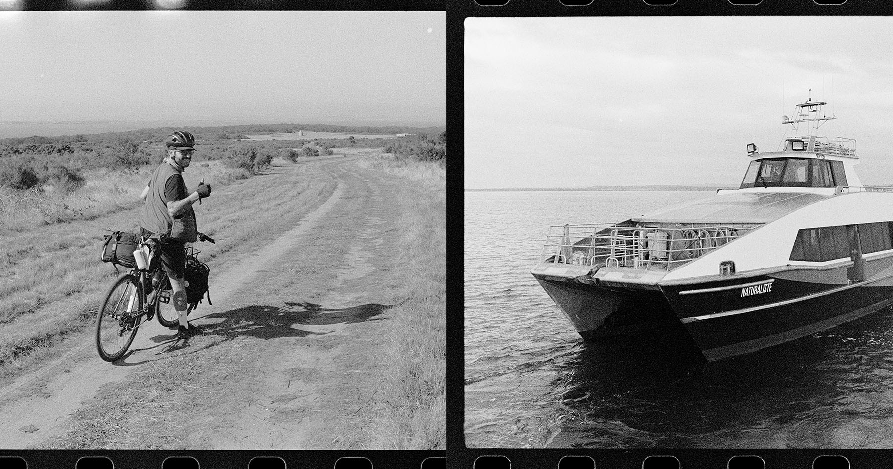 Bikepacking Bellamarin with a 35mm Film Camera (Video)Bikepacking.com19h ago
- Intense Cycles Launches Spider Pro & Foundation BuildsPinkbike19h ago